Visualize your data peaks and trends with this Mountain Chart Infographic.
Inspired by natural mountain shapes, this chart design helps you show fluctuations, comparisons, or performance metrics over time. Each peak represents a value or data point — perfect for business analytics, financial reports, or progress tracking.
The gradient blue tones and smooth overlapping shapes create a clean, modern aesthetic. Fully editable in PowerPoint and Google Slides, this chart template lets you adjust colors, values, and text with ease to match your brand or theme.
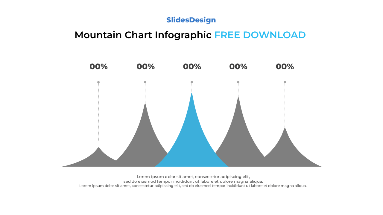
Features five layered mountain peaks for data comparison and trend visualization
Fully editable in PowerPoint (PPTX) and Google Slides
Ideal for performance trends, data analytics, and timeline presentations
Includes percentage and text placeholders for each peak
Smooth, gradient-based design for a modern visual impact
Compatible with both Standard (4:3) and Widescreen (16:9) formats
Easy to recolor or reshape for any presentation theme
Sales or Revenue Growth Charts
Website Traffic or KPI Trends
Performance Comparison Between Categories
Market Analysis or Financial Reports
Progress or Timeline Visualization
Research and Data Presentation Slides
It’s designed to display data trends and performance over time, showing rises and falls similar to a line chart but with a more visual and organic feel.
Yes! You can duplicate or remove shapes to match your dataset — whether you need three, four, or more peaks.
Payment isn’t required,
but donations are always appreciated!
Your donation goes a long way to helping us run slidesdesign.com! 😊