The 3D Cylinder Chart Template is a modern and professional visual tool designed to turn data into an engaging 3D experience.
Instead of flat bar charts, this template uses transparent cylindrical shapes that add depth and dimensional clarity, making your presentation stand out instantly.
Each cylinder represents a quantitative value — perfect for business reports, marketing metrics, educational visuals, and scientific data analysis.
The realistic glass-like gradient effect creates the illusion of volume, giving audiences a better grasp of proportional differences and data hierarchy.
You can easily adjust the height, color, or transparency of each cylinder in PowerPoint or Google Slides, enabling full control over your visual design.
Whether you want to compare growth rates, show survey results, or present project milestones, this template helps you communicate data with visual impact and elegance.
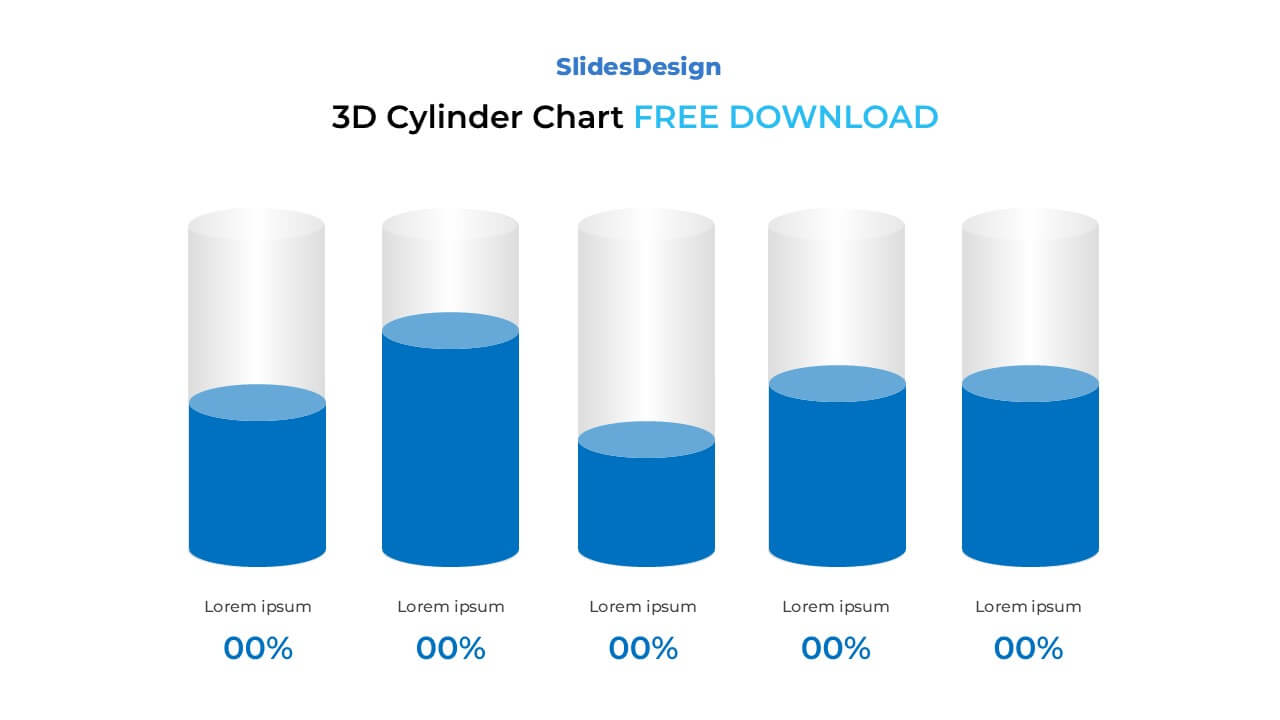
5 3D cylindrical bars representing comparative data
Fully editable in PowerPoint (PPTX) and Google Slides
Transparent layered design for realistic 3D appearance
Perfect for financial, marketing, or academic reports
Adjustable height, gradient, and shadow effects
Vector-based shapes — scale freely without losing quality
Clean minimalist layout compatible with corporate branding
Available in Standard (4:3) and Widescreen (16:9)
Financial Data Visualization — show revenue, expenses, or growth projections
Market Analysis — display customer segmentation or performance benchmarks
Education & Research — present comparative experiment results or statistical data
Business Reports — summarize quarterly outcomes, KPIs, or progress
Project Management — visualize resource allocation or completion percentages
It’s used to present numerical data in a visually dynamic way. The 3D depth helps highlight differences in volume or performance, making it easier for viewers to interpret complex data intuitively.
Absolutely. You can insert text boxes, percentages, or icons directly on or above each cylinder to make your data clearer and more engaging.
It’s ideal for financial, marketing, sales, and performance presentations — any scenario where you want to show progress, proportion, or trend differences in a visually appealing way.
To preserve the depth and transparency, export the slide as a PNG image or PDF rather than printing directly. This ensures your gradients and shadows remain consistent.
Yes! It’s perfect even for non-designers — just replace placeholder text and drag the cylinders to your preferred height. PowerPoint’s alignment tools make editing effortless.
Payment isn’t required,
but donations are always appreciated!
Your donation goes a long way to helping us run slidesdesign.com! 😊