

They say a picture is worth a thousand words. But in a presentation, the right picture could be worth the attention of a thousand people.
In our visual-first world, images aren’t just decorative—they’re powerful tools for communication. A carefully chosen background photo can anchor your message, direct your audience’s focus, and create a lasting impression. But the wrong image? It can distract, confuse, or even make your content look unprofessional.
Here are seven golden rules for choosing presentation background images that actually work—visually, strategically, and emotionally.
1. Start With Purpose: Does This Image Echo Your Message?
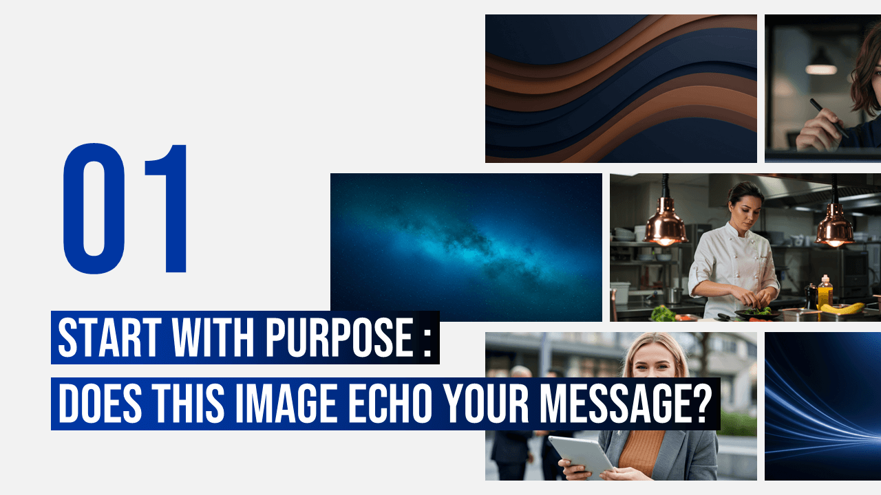
Not all beautiful images belong in your slides. If a photo doesn’t reinforce your message, it’s just noise.
Ask yourself:
Does this photo deepen the story I’m telling?
Does it relate to the theme or tone of my content?
Go beyond the obvious. If you’re presenting on innovation, skip the stock image of a lightbulb. Maybe a bird taking flight or a close-up of gears in motion says more—visually and metaphorically.
💡 Quick Tip: Search using abstract keywords like “transformation” or “possibility” to discover visuals that spark emotion and imagination.
Click here and get the right background image
2. Let the Slide Breathe: Embrace Negative Space
White space (or any uncluttered area) isn’t empty—it’s powerful. It allows your text to shine and your image to settle into the background, rather than competing for attention.
A great background:
Doesn’t overwhelm
Creates natural zones for text placement
Keeps the layout clean and readable
Reserve full-screen imagery for moments of impact. Otherwise, make space your ally.
3. Simplicity = Clarity

Visual clutter is the enemy of focus. The more details in your image, the harder it is for your audience to know where to look—and what to read.
Stick with:
Photos that have one clear focal point
Simple compositions with minimal background noise
Space for text either naturally or through intentional cropping
👀 Bonus Insight: If your image includes a person, have them look toward your slide content—not away. Human eyes instinctively follow another’s gaze.
4. Contrast Isn’t Just Aesthetics—It’s Accessibility
If your audience squints, your message gets lost.
High-contrast doesn’t mean neon colors. It means enough distinction between text and background. Dark photos? Use light text. Light images? Go dark with your font.
And avoid:
Busy gradients
Highly saturated patterns behind text
Photos with both light and dark extremes
You want clarity, not camouflage.
5. Resolution Matters—Always
That perfect image? It’s useless if it’s pixelated.
Always use high-resolution images, especially if you’re projecting or presenting on large screens. Low-res photos:
Look unprofessional
Distract from your message
Undermine your credibility
💻 Pro Tip: You can get high-resolution image if your click here
6. Visual Consistency Builds Trust
If your slides jump from hyperrealistic photos to cartoonish illustrations to vintage film shots, you’re sending mixed signals.
Your image choices should:
Align stylistically (e.g. all black-and-white, or all warm-toned)
Follow a visual rhythm or color story
Reinforce the mood of your brand
Try running your slideshow using images only. If your narrative still holds up, you’re visually consistent.
7. Reflect Your Brand, Always
Your slides are a reflection of your identity—whether personal or corporate.
Think about:
Color palettes that match your branding
Subjects that align with your tone (playful, formal, adventurous?)
Style (clean? gritty? aspirational?)
For example:
A wellness brand might lean on soft pastels and nature shots.
A fintech startup might go sleek, minimal, and monochrome.
When in doubt, refer to your website or style guide—and let that be your north star.
Choose With Intention, Present With Confidence
The background image isn’t just background noise—it’s part of the message. When chosen intentionally, your photos can amplify clarity, evoke emotion, and elevate your entire presentation.
✅ Keep it simple
✅ Make space for your story
✅ Stay true to your brand
Let your images work with your words, not against them.
Want ready-made designs with stunning backgrounds built in? Explore lots of customizable slide templates online that already follow these principles. Your next presentation could be one click away from visual brilliance.
https://slidesdesign.com/stock-images/


