Labor Day, celebrated on the first Monday of September in the United States, is more than just a day off work. It is a holiday that honors the hard work and contributions of American workers while also marking the symbolic end of summer and the transition into fall. For many people, Labor Day isn’t just a holiday—it’s a season of retail sales, backyard barbecues, parades, and community gatherings.
Yet the essence of Labor Day runs deeper than festive celebrations. Dating back to the 1880s during the Industrial Revolution, workers collectively took action to improve poor working conditions and fight for their rights. Their determination laid the groundwork for monumental changes such as child labor bans, the eight-hour workday, and the establishment of social security systems. Because of this historical legacy, Labor Day design today is not merely decorative; it’s a powerful visual language that communicates both history and brand identity.
Many brands and designers use this period to launch Labor Day design campaigns. But what kind of visuals truly resonate with audiences? Let’s explore seven practical Labor Day design ideas that you can apply across posters, flyers, and social media campaigns to capture attention and convey meaning.
7 Labor Day Design Ideas for Decorations
- Dynamic
- Minimalist
- Colorful (Playful)
- Vintage
- Pixelated
- Grunge
- Patriotic
1. Dynamic

(Source – FreePik)
Sometimes going bold is the right choice. Dynamic designs make use of striking fonts, bold graphics, and layouts with diagonals or curves that immediately capture the eye. Perfect for large-scale retail sales or online banner ads, this style imprints the image of an energetic and action-driven brand.
2. Minimalist

(Source – FreePik)
In contrast, some brands opt for sophistication through simplicity. Minimalist designs use clean typography, muted color palettes, and generous white space to convey elegance. This “quiet confidence” makes them especially suitable for premium restaurants, luxury hotels, or upscale product promotions.
3. Colorful (Playful)
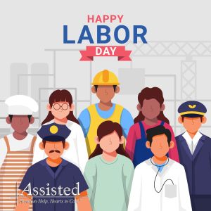
(Source – By Assisted Home Health and Hospics in Pinterest)
Labor Day is also a family-oriented holiday, making playful and colorful graphics a great fit. Bright illustrations, cheerful palettes, and whimsical elements are ideal for children’s events or community gatherings. These designs create a welcoming atmosphere that boosts participation and appeals to families.
4. Vintage
(Source – By Dbackfrop in Pinterest)
If you want to highlight the historic roots of the labor movement, vintage styles are perfect. Designs inspired by early 20th-century posters evoke nostalgia and authenticity. They work well for NGOs, awareness campaigns, or brands that wish to project a sense of tradition and values.
5. Pixelated

(Source – By Freepik)
Pixel art and retro digital aesthetics speak directly to younger audiences. For social media challenges, online contests, or digital-first campaigns, pixelated graphics deliver “modern fun” and encourage sharing, making them a natural fit for viral marketing.
6. Grunge

(Source – By logoifinix in Freepik)
With rough textures, distressed details, and raw energy, grunge-style graphics embody resistance and activism. They are effective for campaigns with a social message, or for events tied to indie and underground culture. This design style immerses viewers in a powerful, authentic atmosphere.
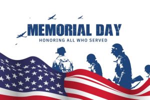
7. Patriotic

(Source – By Freepik)
The classic red, white, and blue color palette is still the most common choice for Labor Day decorations. It instantly communicates patriotism and familiarity.
What Kind of Labor Day Design Do Consumers Prefer?
So, what do consumers actually gravitate toward when it comes to Labor Day design and decorations? According to DesignWiz, the answer is clear: the majority still favor the classic red, white, and blue palette, rooted in the American flag. But this preference goes beyond symbolism—each color evokes specific psychological responses.
Red symbolizes passion, energy, and urgency, which is why it is so effective in drawing attention to sales and call-to-action buttons. White represents purity, honesty, and transparency, reinforcing trust between brands and their audiences. Blue conveys stability and security, making people feel safe and grounded. When combined, these three colors evoke strong patriotic emotions that drive positive consumer responses.
At the same time, premium markets are shifting toward refined alternatives that still carry patriotic undertones.
Burgundy & Gold: This combination balances depth and richness, with gold (#FFD700) adding a sense of luxury to burgundy (#800020). It appeals strongly to premium customers while maintaining a celebratory, patriotic atmosphere.
Navy & Cream: Deep navy (#1B365D) paired with soft cream (#F7F3E9) creates a sleek and timeless look. This palette is especially effective for high-end restaurants, luxury retail stores, and formal offline events.
In other words, traditional patriotic colors dominate mass markets, while premium color palettes provide distinction in upscale sectors. The key lies in tailoring your labor day design strategy to the audience you aim to reach.
How Should Businesses Approach Labor Day Flyer Design?
Designing Labor Day flyers isn’t a one-size-fits-all process. Different industries require different approaches to connect with their audiences.
1. Retail and Sales
For retail stores and shopping malls, the goal is clear: highlight the discount. Large numbers, bold text, and dynamic graphics grab attention quickly. Adding patriotic red and blue accents makes the design feel both festive and trustworthy. Think “50% OFF” splashed across the page in red—impossible to ignore.
2. Restaurants and Dining
Here, the approach depends on positioning. Casual, family-friendly restaurants benefit from the same energetic, playful approach as retail sales, attracting large crowds. In contrast, upscale restaurants need to signal exclusivity. Using burgundy and gold or navy and cream creates an elegant, premium image that matches the experience they want to provide.
3. Community Events
Community gatherings should focus on inclusivity, safety, and togetherness. Minimalist and friendly designs work best here—simple illustrations, approachable fonts, and calm colors encourage participation and make people feel welcome. Adding refined palettes like burgundy and gold can provide a sense of stability while still honoring the occasion.
Where to Find More Labor Day Design References
Of course, the internet is full of design inspiration. But if you’re looking for resources that are both accessible to everyday consumers and useful for designers, here are three go-to sites:
1. Pinterest
A visual treasure trove for inspiration. Pinterest is widely used not just by designers but also by everyday people. In fact, many young Americans (Gen Z and Millennials) use Pinterest to discover design ideas—whether for fashion, events, or holiday graphics.
2. Freepik
One of the most popular platforms for free and premium design assets. Simply search “Labor Day” and you’ll find countless labor day design ideas, including ready-to-use illustrations, icons, and templates.
3. SlidesDesign
A site offering free PowerPoint and Google Slides templates. Beyond Labor Day themes, you’ll find a wide range of designs that can be customized for campaigns, presentations, and events. It’s perfect for anyone who wants to download and apply professional-looking designs quickly.
As you prepare for Labor Day, remember that your design choices do more than decorate a space—they influence engagement, drive sales, and shape brand perception. The seven Labor Day design ideas outlined here can help you create visuals that not only catch the eye but also inspire action.
By combining creativity with strategy, and by tailoring your color palettes and styles to your target audience, you can design posters and flyers that resonate deeply. This Labor Day, step outside the box, reflect your brand’s unique personality, and craft Labor Day decorations that leave a lasting impression.