

In a presentation, your slides are more than visual aids—they are the stage. And like any stage, lighting, mood, and atmosphere shape how the audience experiences the message. That’s where color becomes a central tool—not a mere aesthetic choice, but a functional component of communication.
Whether you are presenting a pitch deck in PowerPoint or delivering a strategy session in Google Slides, your color decisions can significantly impact how your audience listens, remembers, and responds.
The Science of First Impressions in Slides
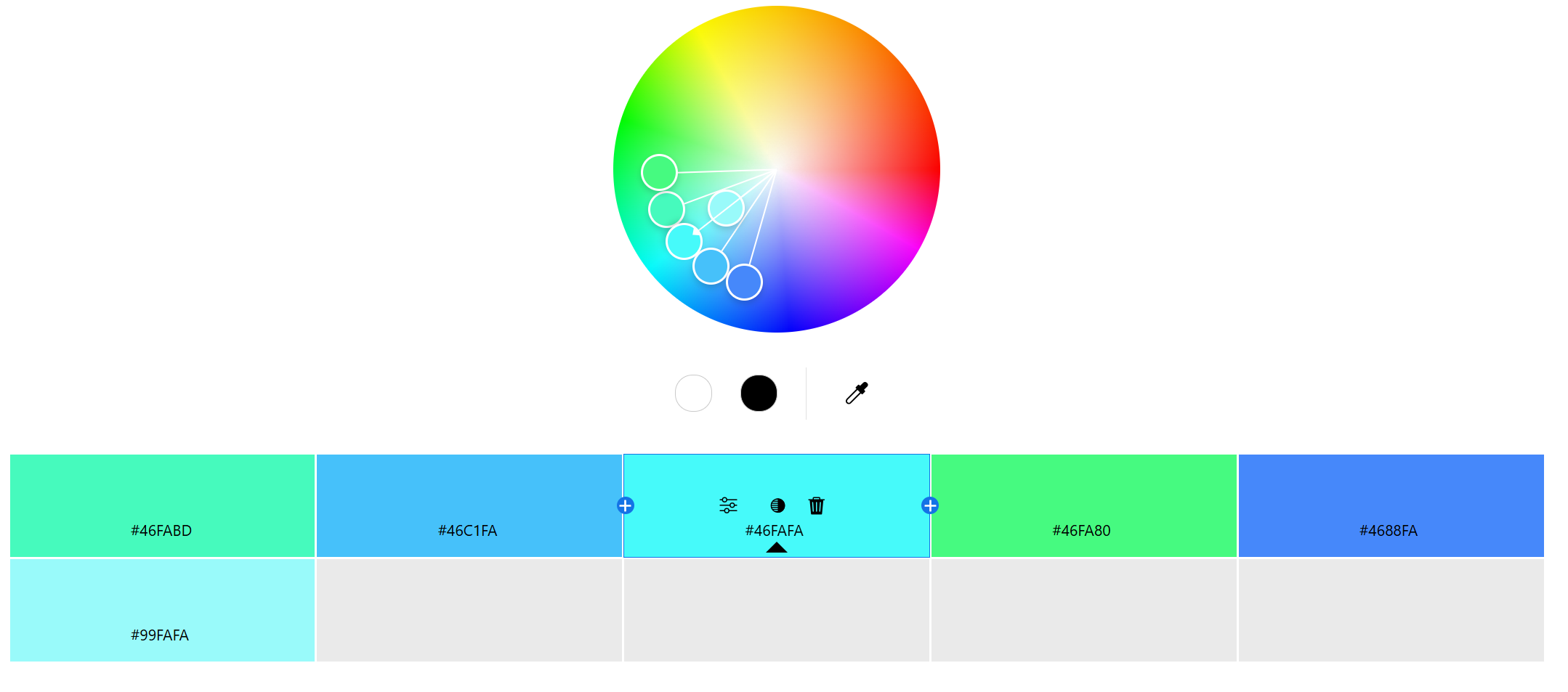
<Adobe Color Wheel>
Audiences begin judging a presentation before the speaker starts talking. This cognitive tendency is known as the primacy effect—the idea that information presented first carries the most weight in shaping perception.
Research by the Institute for Color Research found that people form a subconscious opinion about a visual stimulus within 90 seconds, and 62% to 90% of that judgment is based solely on color.
This means your opening slide—its background color, accent elements, text color—is already influencing the audience’s sense of credibility, professionalism, and mood.
Color Guides Attention on Every Slide
Once the presentation begins, color helps manage where your audience looks. Every slide competes for attention in a sea of distractions—phones, emails, daydreams. Without clear visual structure, your content risks being lost.
Color supports this structure in multiple ways:
Highlighting key text or data using accent colors
Separating titles from body text with contrasting tones
Using consistent background colors to maintain flow
For example, in a financial report, blue tones may help reinforce authority and stability, while a red accent can be used to highlight risk or urgency.
Color Enhances Understanding and Retention
Psychologists have shown that color improves not only visual appeal but also cognitive retention. According to a study published in the Journal of Experimental Psychology, colored visuals boost memory performance compared to monochrome ones. Slides that incorporate color into key visuals—charts, infographics, emphasis text—help audiences remember complex concepts more effectively.
In short, when color is used to differentiate and emphasize, it adds a second layer of meaning that words alone cannot provide.
Emotional Framing Through Color Choice
Every color carries emotional weight. In presentations, color doesn’t just frame content—it frames emotion.
Blue evokes trust and calm—ideal for consulting reports or healthcare slides.
Green implies sustainability or balance—perfect for environmental or wellness topics.
Red creates urgency or excitement—useful in sales presentations or calls to action.
If your color palette clashes with your message, you risk cognitive dissonance. A fundraising proposal asking for empathy won’t land well if designed in cold greys and blacks. Conversely, a corporate risk assessment shouldn’t be wrapped in playful pastels.
Designing Color Schemes That Support Delivery
When working with presentation tools like PowerPoint or Google Slides, building a deliberate palette is essential.
The widely recommended 60-30-10 rule offers a functional guide:
60% of the design should be your primary (dominant) color—backgrounds or major shapes
30% should be your secondary color—headings, charts, or containers
10% is reserved for your accent color—calls to action, keywords, data highlights
Sticking to this rule helps maintain balance while preventing overload. For speakers, it also ensures that visuals are doing their job without undermining legibility or consistency.
Real-World Presentation Impact: Color in Action
There’s more than theory to this. In one study by Xerox, 90% of respondents said they remembered presentations better when color was used effectively. In another case, a company added color to highlight key elements in billing documents and saw payments arrive an average of 14 days earlier.
Even in phonebook ads, color versions were read up to 42% more often than black-and-white ones. These patterns hold true in presentations: color increases visibility, clarity, and follow-through.
Your Slides Speak Before You Do
When delivering a presentation, you are not just sharing information—you are orchestrating an experience. And color is one of the most direct ways to influence that experience.
From the primacy effect at your title slide, to color-coded charts that clarify your argument, to emotionally tuned palettes that align with your message—your color choices matter more than you might think.
Color is not decoration. It’s direction.
And when used strategically, it turns good slides into unforgettable presentations.


